CSS grid template rows
CSS grid-template-rows property defines the rows with their sizes. Their sizes are fixed or calculated automatically by row sizing functions. We may use named grid lines (in between the rows) to place an item within a grid otherwise use default numbered grid lines.
Example
<style>
#grid{
 display:grid;
 height:250px;
 grid-template-rows: 90px 1fr 80px;
}
#item1{
 grid-row: 2/4; /* grid line 2 to 4 */
}
</style>

Try </>
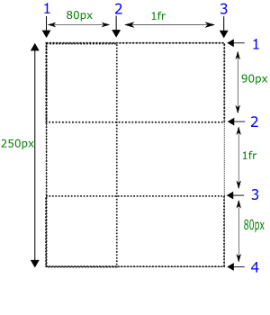
In the above example, #item1 occupies space from grid-line 2 to 4 i.e. two rows (1fr, 80px).
What will you learn?
The grid framework to understand the layout of a grid. The fr unit, represents fractional flexible length. grid rows repeat function to fit the content within grid or to fill the grid automatically. row span to extend the placement of item to more rows. At the end we'll see both grid rows and columns.
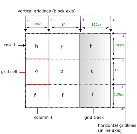
grid framework (layout)
Values
We can use different kind of row lists as the value. We'll discuss these row lists completely.
1. none
There are no grid rows within a grid.
2. track-list
The value of grid-template-rows consists of track size with their grid line names (optional). And the size of each track is fixed. There might be repetition of rows in this row list. See the syntax given below.
Syntax
track-list = [line-names] track-size track-repeat [line-names]
track-repeat means syntax on right side may be repeated for more rows. See the example given below.
Example
<style>
#grid{
 display: grid;
 height:250px;
 grid-template-rows:
 [header-start] 90px [header-end] /*row1 */
 [main-start] 1fr [main-end] /* row2 */
 [footer-start] 80px [footer-end]; /* row3 */
}
#item1{
 grid-row: main-start/main-end;
}
</style>

Try </>
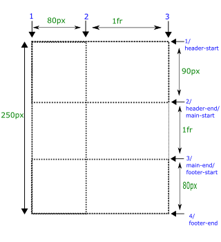
The above given example is the updated version of numbered grid lines but with named grid lines.
When there are two consecutive grid line names, they are merged i.e. [header-end] [main-start] can be written as [header-start main-start].
3. auto-track-list
auto-row-list automatically defines rows of different heights. And the height is determined by the track sizing functions such as length-percentage of grid height, minimun or maximum height of grid item within a row.
Example
<style>
#grid{
 display: grid;
 height:250px;
 grid-template-rows: 20%  1fr  min-content;
}
#item1{
 grid-row: 3/4;
}
</style>

Try </>
The first row takes 20% of the total height of grid.
The second row takes remaining space after 20% and min-content.
min-content means that it takes the contribution from the largest minimum height of an item present in that row.
Its syntax is the same as track-list but it provides track sizing functions that automatically determine the size of the rows. track sizing functions are given below.
length-percentage
length-percentage determines the size of a row relative to the height of grid container. For example, 30% row size means that row takes 30% of the height of grid container.
Example
<style>
#grid{
 display: grid;
 height:250px;
 grid-template-rows: 30%  50px  100px;
}
#item1{
 grid-row: 2/4;
}
</style>

Try </>
min-content
min-content represents the minimun height of the grid item present in the row. It means that the row height should be greater than or equal to minimum height of a grid item.
Example
<style>
#grid{
 display: grid;
 height:250px;
 grid-template-rows: 50px  200px  min-content;
}
#grid > #item1{
 min-height:80px;
 grid-row:3/4;
}
</style>

Try </>
max-content
max-content represents the maximum height of a row. The row height should be less than or equal to the maximum height of the grid item.
Example
<style>
#grid{
 display: grid;
 height:250px;
 grid-template-rows: 50px  200px  max-content;
}
#grid > #item1{
 max-height:20px;
 grid-row:3/4;
}
</style>

Try </>
minmax(min,max)
minmax function restricts the height of a row to the min and max values i.e. the height of a row should be greater than or equal to min value of an item and less than or equal to max value.
Example
<style>
#grid{
 display: grid;
 grid-template-rows: 40px  60px  minmax(auto,100px);
}
#item1{
 grid-row: 3/4;
}
</style>

Try </>
fr unit
It is flexible length. fr unit represents a fraction of the grid container. It is obtained by subtracting the height of other fixed or fractional sized rows from the total height of grid.
Example
<style>
#grid{
 display: grid;
 height:250px;
 grid-template-rows: 90px  1fr  50px;
 grid-template-columns:80px 1fr;
}
#item1{
 grid-row: 2/3;
}
</style>

Try </>
auto
'auto' value automatically determines the height of a row. It represents the minimum (in case of minimum) or maximum (in case of maximum) height of a grid item in this row.
Example
<style>
#grid{
 display: grid;
 height:250px;
 grid-template-rows: 20px  auto  70px;
}
#item1{
 grid-row: 2/4;
}
</style>

Try </>
Applicable to
It is applicable to all of the elements including pseudo elements (::before, ::after, ::marker).
Browser support
Browsers |
 |
 |
 |
 |
 |
grid-template-rows |
✓ |
✓ |
✓ |
✓ |
✓ |
The grid-template-rows property has been covered up completely. If you are an advanced learner and want to get more on grid-template-rows property, continue to the remaining part otherwise skip to the next tutorial.
repeat() function
We can use repeat() function to repeat grid rows instead of manually defining the rows. There are two arguments in the repeat() function.
First argument of repeat() function may include a positive integer, auto-fill or auto-fit.
The second argument accepts the rows that are repeated.
A positive integer
Positive integer as the first argument represents the number of times the second argument should be repeated.
See the example given below to understand the repeat function.
Example
<style>
#grid{
 display: grid;
 grid-template-rows: repeat(3, 20px  30px  40px);
}
#item1{
 grid-row: 2/4;
}
</style>

Try </>
The above given row list is repeated three times.
auto-fill
auto-fill automatically repeats a row list (given as second argument) to fill the grid automatically without overflowing and and the remaining space represents a flexible row i.e. it can contain as many grid items as possible.
Example
<style>
#grid{
 display: grid;
 height:280px;
 grid-template-rows: repeat(auto-fill, 20px  30px  40px);
}
#item1{
 grid-row: 9/10;
}
</style>

Try </>
In the above example, There are total 11 grid lines and 10 rows. The remaining space of 10px (from grid line 10 to 11) represents 10th row and it is flexible only i.e. the content can cause the row height to be greater than 10px.
auto-fit
auto-fit is the same as auto-fill except that it fits content (rows that are currently used by items) within grid starting from the top of the grid without leaving any space.
Example
<style>
#grid{
 display: grid;
 height:280px;
 grid-template-rows: repeat(auto-fit, 20px  30px  40px);
}
#item1{
 grid-row: 9/10;
}
</style>

Try </>
In this case, the remaining space also represents a flexible row only. It can occupy all the space of grid (if available).
Types of grid lines
There are two types of grid lines that are used differently as the value in grid-template-rowss
numbered grid lines
named grid lines
Numbered grid lines
We simply specify row heights as the value to specify different rows within a grid.
Example
<style>
#grid{
 display:grid;
 height:250px;
 grid-template-rows: 90px 1fr 80px;
}
#item1{
 grid-row: 2/4; /* grid line 2 to 4 */
}
</style>

Try </>

'1fr' represents a fraction of the total height of the grid. There are four vertical ([1-4]) and three horizontal ([1-3]) grid lines in the above example.
#item1 occupies two rows i.e. '1fr' and 150px.
A track is space between two adjacent vertical or two adjacent horizontal lines. A track may also be called as row. Here a track list means a list of rows.
Named grid lines
In this method, we use grid line names instead of numbered grid lines to place the items within the grid. See the example in the values section.
Example
<style>
#grid{
 display: grid;
 height:250px;
 grid-template-rows:
 [header-start] 90px [header-end] /*row1 */
 [main-start] 1fr [main-end] /* row2 */
 [footer-start] 80px [footer-end]; /* row3 */
}
#item1{
 grid-row: main-start/main-end;
}
</style>

Try </>

Was this article helpful?


