
CSS align-content property
Description
CSS align-content property is responsible to align the flex or grid lines vertically (along cross/block/column) within a flex or grid container. It adjusts the space between the grid or flex lines to align the content items vertically.
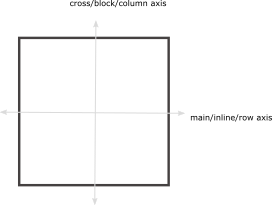
Please don't confuse lines with the items. Because line occupies the full width of the container (line is horizontal). And more than one items can occupy a single line but vice versa is not true.
We are using a flex container as a container to explain this property.
Syntax
align-content : normal | baseline | center | stretch | flex-start | flex-end | space-between | space-around | space-evenly
Property values
normalDefault
-
It stretches out the lines so as to fill the height of the container completely.
align-content: normal;
baseline
-
It aligns the lines on the normal baseline as you usually see the placement of lines on their own baselines.
align-content: baseline;
center
-
It aligns the lines in the middle of the container.
align-content: center;
stretch
-
It stretches all of the lines in such a way that they occupy the full height of the container.
align-content: stretch;
flex-start
-
flex-start aligns all of the lines at the start of the flex container.
align-content: flex-start;
flex-end
-
flex-end aligns all of the lines at the end of the flex container.
align-content: flex-end;
space-between
-
In this case, the first line is aligned at the start of the container and the last line is aligned at the end of the container. The remaining lines are placed in such a way that white space is distributed equally among the remaining lines.
align-content: space-between;
space-around
-
The objects are distributed in such a way that there is the same space between the lines except at the start and end of the container.
There is half sized space (half of the space that is between any two of the remaining lines) before the first object and after the last line.
align-content: space-around;
space-evenly
-
It adjusts the alignment of lines so as to distribute equal space between and around the lines.
align-content: space-evenly;
Applicable to
It applies to flex or grid containers.
From web4college, the free CSS digger
Detailed overview of align-content property
Now let's dig into the details of how align-content property works actually?
1. What is a flex/grid line?
2. Difference between lines and items (elements)
3. The values of the align-content property
4. Browser support for the align-content property
5. Examples
Table of contents
1. What is a flex/grid line?
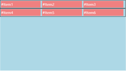
A line is the horizontal line that occupies the full width of the container. Each line may contain one or more items. In the following image, the rectangular black box represents one flex line.
2. Difference between lines and items (or elements)
A line may contain more than one items but one item cannot occupy more than one lines. The number of lines depends upon the number of items and their width.
In the above given image, the flex line contains three items.
3. The values of align-content property
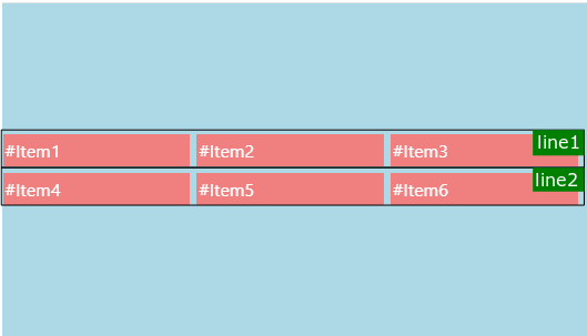
Remember that the flex container must have flex-wrap: wrap; property to show the behavior of align-content property. (* flex-wrap: wrap; allows the items float to the next line on overflow.)
In the following case, the height of the flex line depends upon the height of the flex items. The black rectangular shape represents one flex line in the following examples.
normal
It represents the normal behavior of the lines i.e. the lines stretche out to occupy the full height of the container (vertically).
baseline
All the lines are placed together at the start of flex container (vertically).
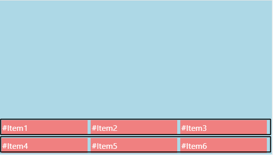
center
All of the lines are grouped together at the center of flex container.
stretch
It is the same as normal i.e the lines are stretched vertically to fill the height of the container.
flex-start
The lines are placed at the start of flex container as in baseline.
flex-end
The lines are placed at the end of the flex container.
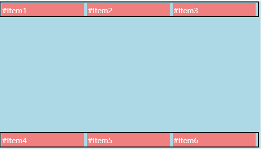
space-between
It equally distributes the space between the lines except the first and last lines are placed at the start and end of the container.
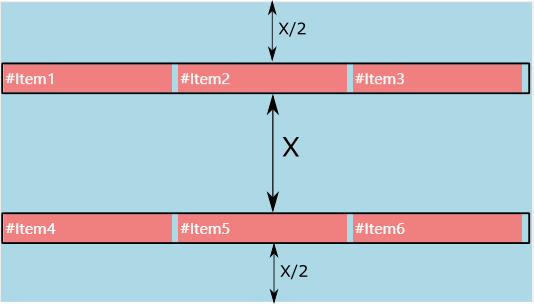
space-around
It equally distributes the space between the flex lines except the first and last lines. There is half sized spaced before the first line and after the last line.
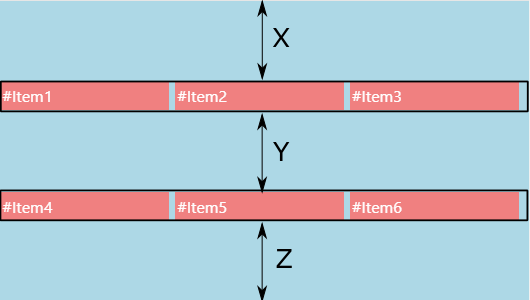
space-evenly
It equally distributes the space between the flex lines. X=Y=Z
4. Browser support for the align-content property
The align-content property applies to grid and flex containers. See the browser support for align-content property.
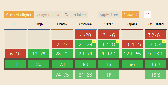
Browser support in a flex container
See the browser support for this property in a flex container.
Browser support in a grid container
See the browser support for this property in a grid container.
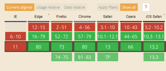
Check browser support for align-content property.
5. Examples
Developers usually face the problems of centering the things within a container. We'll use this property to center the child items within a container (vertically).
How to center the button within a container? (vertically)
div{
width:100%;
height:200px;
background-color:lightblue;
display:flex;
flex-wrap:wrap;
align-content:center;
}

<div>
    <button>Button</button>
</div>
It aligns the button at the center of container.
How to center the image within a container? (vertically)
div{
width:100%;
height:200px;
background-color:lightblue;
display:flex;
flex-wrap:wrap;
align-content:center;
}


<div>
    <img src=""/>
</div>
It aligns the image at the center of container.
#Item1
#Item2
#Item3
#Item4
#Item5
#Item6


