
CSS box shadow generator
The following generator generates or drops shadow of a box. The shadow my be dropped inside the box (inner shadow) or outside the box. The shadow tends to create a 3D effect.
Layer 1:
Layer 2:
div {
box-shadow:;
-webkit-box-shadow:;
-moz-box-shadow:;
}
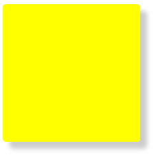
Box shadow layer 1
1. Horizontal offset: 10px
2. Vertical offset: 10px
3. Blur radius: 10px
4. Spread distance: 0px
6. Inset:
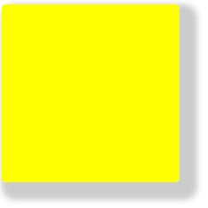
Box shadow layer 2
1. Horizontal offset: 10px
2. Vertical offset: 10px
3. Blur radius: 15px
4. Spread distance: 0px
6. Inset:
How box shadow generator works?
The use of box shadow generator is very simple. You just need to change the values. As a result the generator generates corresponding values that can be used for any element.
Now we'll the see what is meant by the values given in the box shadow generator.
Suppose We have a box having width and height of 200px. And we'll change the values and see the resulting box shadow.
1. Horizontal offset
Horizontal offset (first value) shifts the box shadow from its original position to left or right depending upon the value.
Positive value shifts the shadow to the right of original position.
Negative value shifts the shadow to the left of original position.

box-shadow: -100px 0px 0px 0px #cccccc;
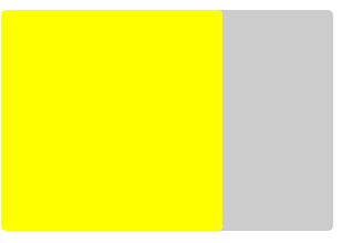
box-shadow: 100px 0px 0px 0px #cccccc;
In the above given shadow generator, the value varies from -100px to 100px.
2. Vertical offset
Vertical offset (second value) shifts the shadow above or below the original position.
Positive value shifts the box shadow below the original position.
Negative value shifts the box shadow above the original position.
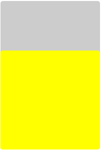
box-shadow: 0px -100px 0px 0px #cccccc;
box-shadow: 0px 100px 0px 0px #cccccc;
In the above given shadow generator, the value varies from -100px to 100px.
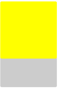
3. Blur radius
Blur radius (third value) creates blur effect of the box shadow. The value of blur radius is always positive.
box-shadow: 10px 10px 0px 0px #cccccc;
box-shadow: 10px 10px 10px 0px #cccccc;
The value of blur radius varies from 0px to 100px. It can not be negative.
4. Spread distance
Spread distance (forth value) shrinks or extends the shadow area on all sides.
Positive value extends the box shadow equally on all sides.
Negative value shrinks the box shadow equally on all sides.
box-shadow: 10px 10px 10px 0px #cccccc;
box-shadow: 10px 10px 10px 10px #cccccc;
The value of spread distance is from -100px to 100px.
5. Box shadow color
It (fifth value) specifies the color of the box shadow. Here we are using hexadecimal value of color i.e. #rrggbb.
box-shadow: -100px 0px 0px 0px #cccccc;
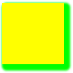
box-shadow: 100px 0px 0px 0px #00cc00;
You can define any color of the box shadow in the shadow generator.
6. Inset
There are two possible positions of box shadow. It may be either outside the box or inside the box. By default, it is outside the box. But inset (sixth) value places the shadow inside the box.
Select the inset checkbox to drop a shadow inside the box.
box-shadow: 10px 10px 10px 10px #cccccc;
box-shadow:10px 10px 10px 10px #cccccc inset;
Was this article helpful?