
border radius
The border radius property converts the rectangular sharp corners of a box into rounded shape corners. The value of border radius may in some unit (px, em) or in percentage (%).
Example
border-radius:50%;
border-top-left-radius:100%;
border-radius:20px / 40px;
border-radius:40px / 20px;
Try </>
There are different perspectives of the border-radius property.
value in some unit (px)
We'll take the value in pixels.
One value for border-radius property
When we specify a value for the radius property, it is applied to all the four corners of box.
Example
<style>
div{
 width:100px;
 height:100px;
 border-radius:50px;
}
</style>

Try </>
If the value of border-radius property is half (50px) of the dimension of the box, then a circular shape is formed.
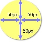
It means that the value of border-top-left, border-top-right, border-bottom-right-radius, border-bottom-left-radius is 50px.
Values for individual properties
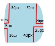
It'll be more clear when we define different properties for the four corners.
Example
<style>
div{
 width:100px;
 height:100px;
 border-top-left-radius:10px 50px;
 border-top-right-radius:20px 50px;
 border-bottom-right-radius:25px 40px;
 border-bottom-left-radius:5px 30px;
}
</style>

Try </>
The above individual properties can be combined into one property. The following example forms the same shape as the example given above.
Example
<style>
div{
 width:100px;
 height:100px;
 border-radius:10px 20px 25px 5px / 50px 50px 40px 30px;
}
</style>

Try </>
value in percentage (%)
In this case, we'll take the value in percentage (%).
One value for border-radius property (%)
Example
<style>
div{
 width:100px;
 height:100px;
 border-radius:50%;
}
</style>

Try </>
values for individual properties (%)
We can also define border-radius properties for the individual corners.
Example
<style>
div{
 width:100px;
 height:100px;
 border-top-left-radius:100%;
 border-top-right-radius:100%;
 border-bottom-right-radius:100%;
}
</style>

Try </>
Practice border-radius property
See how border-radius property transforms the corners into rounded shape.
width:100px;
height:100px;
border-top-left-radius:0%;
border-top-right-radius:0%;
border-bottom-right-radius:0%;
border-bottom-left-radius:0%;
The width and height of the box is 100px.
You may use border radius generator to round the corners of a rectangular shape.
Learn how to make an isosceles triangle or right triangle using border radius property.
Next Previous
Was this article helpful?


