
12 methods for vertical centering of the content
The alignment of the content always seems to be a big problem to a developer especially the alignment of content at the center (both vertically and horizontally). Most developers consider the vertical centering much difficult than the horizontal centering. And I am not gonna negate it. This is why I have given the 12 methods to align the text in the middle and to align one or more divs of within other div.
These methods require little attention and won't take much time. At the end of the tutorial, you'll be able to align any kind of elements such as the alignment of the image, the alignment of one or more divs at the center of the page or other div, etc. We are introducing align-content and many other properties that can set more than one divs at the center.
Let us dig out these methods one by one to place the content at the center.
1. align-content method
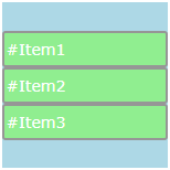
In this method, we use align-content property to align the content vertically i.e along Y-axis. There are many values associated with align-content property. And 'center' value aligns the content at the center (vertically).
Example
<style>
.element{
display: flex;
flex-wrap: wrap;
align-content: center;
}
</style>
Try </>
This way you can also align more than one divs at the center. This property is applicable to flex or grid containers.
Note: You must apply flex-wrap: wrap; property to the element otherwise this method will not work.
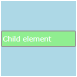
2. align-items method
It aligns the child items vertically i.e. along Y-axis. There are many values of align-items that you can find at align-items demo. And 'center' value aligns the items in the middle of the container (vertically).
Example
<style>
.element{
display: flex;
flex-wrap: wrap;
align-items: center;
}
</style>
Try </>
And this property is applicable to flex or grid containers.
Note: You must apply flex-wrap: wrap; property to the element otherwise this method will not work.
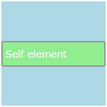
3. align-self method
The item aligns itself along Y-axis. And 'center' value sets the item in the middle of the container (vertically).
Example
<style>
.element{
display:flex;
flex-wrap: wrap;
}

.child{
align-self:center;
}
</style>
Try </>
Check out the other values of align-self property. Remember that this property is applicable to flex or grid containers only.
Note: You must apply flex-wrap: wrap; property to the element otherwise this method will not work.
4. place-content method
The methods we have discussed so far are only for vertical centering of the content. Now, we see the place-content property that aligns the content both vertically and horizontally. 'center' value aligns the content at the center.
Example
<style>
.element{
display: flex;
place-content: center;
flex-wrap: wrap;
}
</style>
Try </>
Dig out the place-content property.This property is applicable to flex or grid containers.
Note: You must apply flex-wrap: wrap; property to the element otherwise this method will not work.
5. place-items method
place-items aligns the items vertically and horizontally. 'center' value aligns the items at the center.

Example
<style>
.element{
display: flex;
place-items: center;
flex-wrap: wrap;
}
</style>
Try </>
Dig out place-items property. place-items property is applicable to flex or grid containers.
Note: You must apply flex-wrap: wrap; property to the element otherwise this method will not work.
6. place-self method
place-self property enables the item to align itself both vertically and horizontally. 'center' aligns the element at the center.
Example
<style>
.element{
display: flex;
flex-wrap: wrap;
}

.child{
place-self: center;
}
</style>
Try </>
Dig out place-self property. This property is applicable to flex or grid containers.
Note: You must apply flex-wrap: wrap; property to the element otherwise this method will not work.
7. margin method
The top and bottom margins should be the same to align the item at the center of the parent element.
.element{
width: 500px;
height: 500px;
}

.child{
width: auto;
height: 50%;
margin-top: 25%;
}
Find more about margin property.
8. padding method
The top and bottom padding should be the same to align the content in the middle of the container.
.element{
width: 500px;
height: 500px;
padding-top: 25%;
}

.child{
width: auto;
height: 50%;
}
9. position method
In this method, the element is positioned. We can set absolute or relative values for the position property. Then, we set the values of the left and top properties so as to align the item at the center.
.element{
width: 400px;
height: 400px;
}

.child{
width: 200px;
height: 200px;
position: absolute;
left: 100px;
top: 100px;
}
The top and bottom distance should be the same for vertical centering. And the left and right values should be the same for horizontal centering.
10. vertical-align method
In this case, the 'middle' value vertically aligns the items in the middle of the container.
.element{
width: auto:
height: 300px;
line-height: 300px;
vertical-align: middle;
}
Sometimes, we have to set line-height equal to the height of element to work the vertical-align property properly. line-height method is not best for multiline paragraph.
11. translate method
The translate function of the transform property moves it away from the top and left sides. The two-parameter values represent the distance of the item from the left and top sides.
.element{
width: 500px;
height: 500px;
}

.child{
width: auto;
height: 50%;
transform: translate(25%,25%);
}
12. table method
Since the content is automatically aligned at the center within a table cell. So we set the display property of element as table-cell.
.element{
display: table;
}
.child{
display: table-cell;
}
Was this article helpful?


