
CSS grid-template-columns property
Description
CSS grid-template-columns represents number of columns with their sizes. Columns are separated with a space.
In the following demo, we have a grid item (green box) that occupies the second column of the grid i.e. from grid line 2 to 3. We'll specify variable number of columns with different sizes in the grid.
Syntax
grid-template-columns : col-size1 col-size2 col-size3 ..
Property values
col1 col2Default
-
The grid consists of two columns each with 50% width. The item occupies the second column (50%).
-
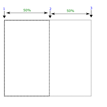
grid-template-columns: 50% 50%;
col1 col2 col3
-
The grid consists of three columns with 20px, 30%, and 1fr sizes. 1fr means remaining fractional size. The item occupies the second column (30%).
-
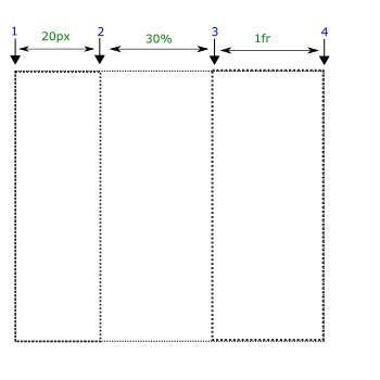
grid-template-columns: 20px 30% 1fr;
col1 col2 col3
-
The grid consists of three columns with 30px, 50px, and 1fr sizes. The item occupies the second column (50px).
-
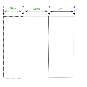
grid-template-columns: 30px 50px 1fr;
Applicable to
It applies to grid-containers.
From web4college, the free CSS digger
Bookmark this page
Ctrl+D


