
CSS grid-column property
Description
CSS grid-column specifies the vertical grid lines to place an item in between. It is a shorthand property of grid-column-start and grid-column-end.
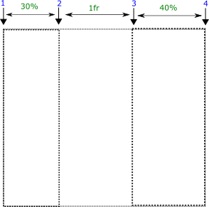
We have a grid that consists of 3 columns and 4 grid lines.
Syntax
grid-column : grid-column-start / grid-column-end | grid-column-start / span columns
Property values
start/end
-
'1/2' means the item is placed between grid lines 1 and 2 i.e. within the first column.
grid-column: 1/2;
start/end
-
'2/3' means the item is placed between grid lines 2 and 3 i.e. within the second column.
grid-column: 2/3;
start/end
-
'3/4' means the item is placed between grid lines 3 and 4 i.e. within the third column.
grid-column: 3/4;
start/span columns
-
The first value represents the grid line and the second value after the span represents the number of columns occupied by the item.
grid-column: 1/span 2;
Applicable to
See longhand properties
From web4college, the free CSS digger
Bookmark this page
Ctrl+D


